Design registers
The design register decides vocabulary — type, colour, space, motion, depth, dividers, ambient behaviour. Eight families, three variants each. Every card below links to a real generated page, not a mockup.
All 24 pages sell the same coffee roastery, with the same audience, goal and copy. Content is held constant on purpose, so any difference you see between two cards is the design register and nothing else. Each page’s hero comes from prompt1’s DEFAULT_HEROES pairing, so the hero is a function of the register rather than a second variable.
Linear
functional, considered, utility-first; personality lives in restraint and rhythm rather than ornament
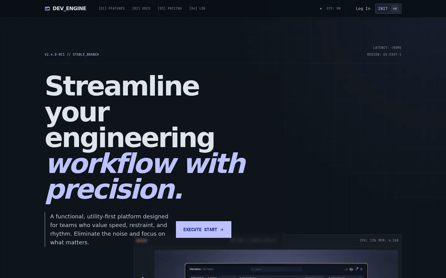
SaaS dashboards, dev tools, B2B platforms, anything that wants to read as "considered, not loud"
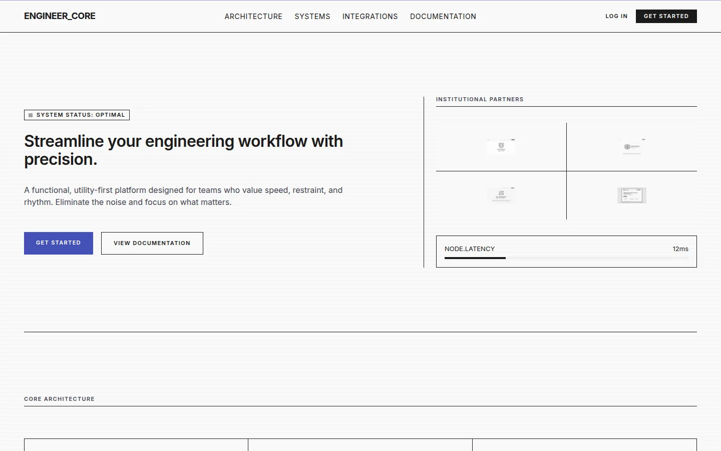
institutional sites, banks, museums, universities, disciplined corporates where credibility = restraint
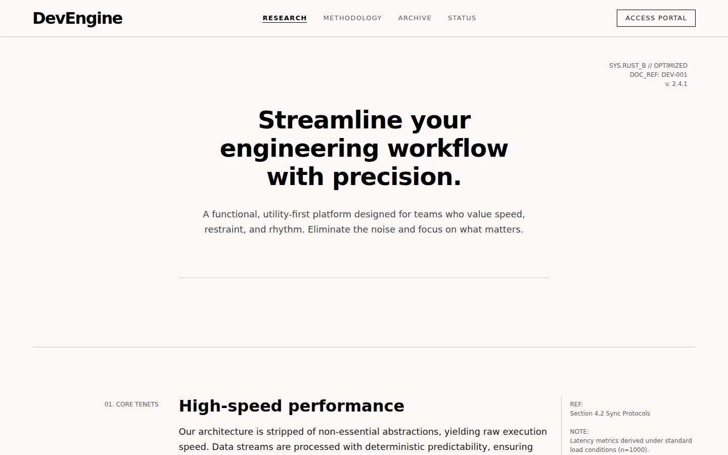
research outfits, longform journalism, policy think tanks, anything where charts and prose share the page
Editorial
content-led, typographic hierarchy; layout composed like a spread; hierarchy from scale and rhythm, not boxes
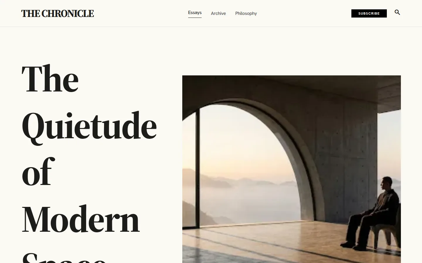
publishers, hospitality, premium retail, content brands, anything that should feel like a magazine spread
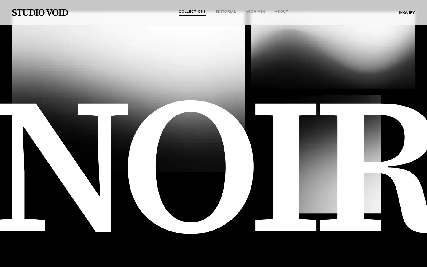
fashion houses, photography portfolios, lookbook sites, beauty editorial — image-led, daring
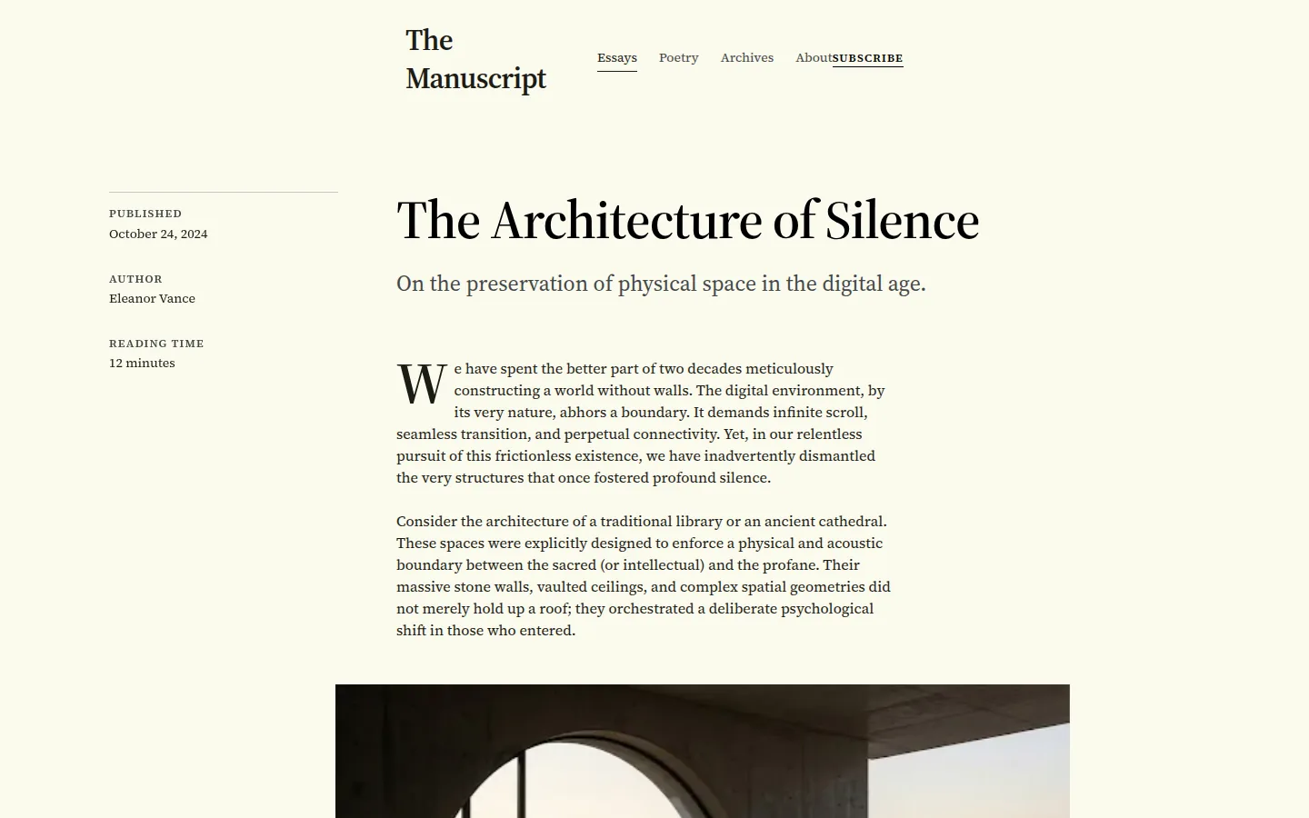
book publishers, essay platforms, literary magazines, indie writing, anyone whose product is prose
Playful
joyful, saturated, expressive; never apologetic about being fun; motion and colour earn their keep
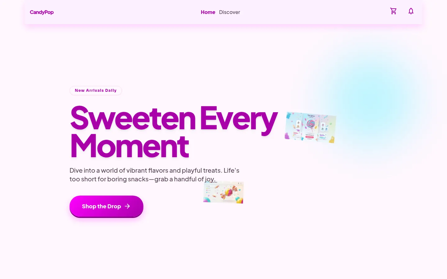
consumer apps, food, lifestyle, anything that earns the right to be joyful
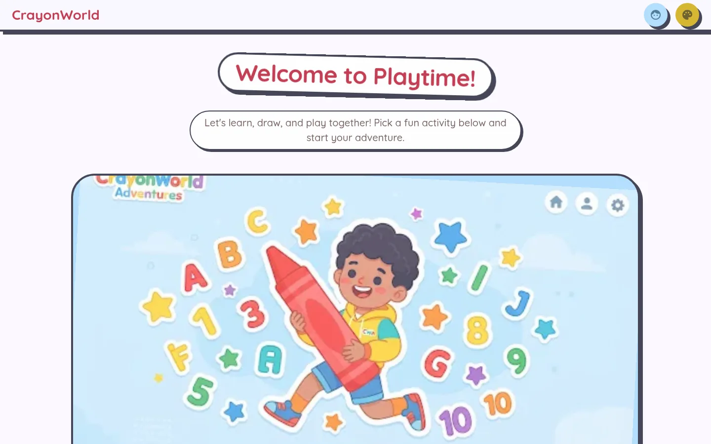
children's products, learning apps, kids' books and games, family services
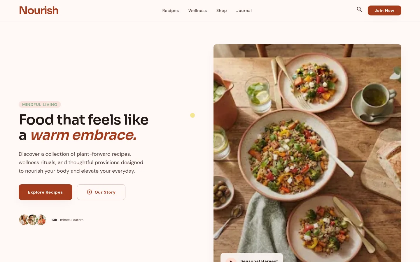
modern food brands, wellness-adjacent lifestyle, DTC consumer where fun is implied but not shouted
Brutalist
the web's raw materials as styling; refusing the polish move is the point of view
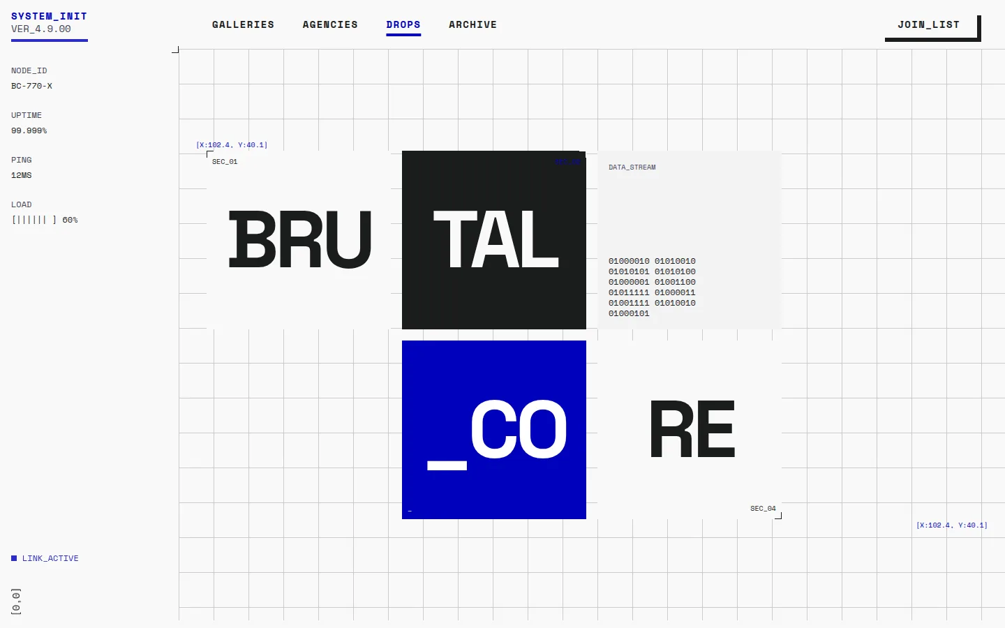
galleries, agencies, fashion drops, anyone whose brand value is having an obvious point of view
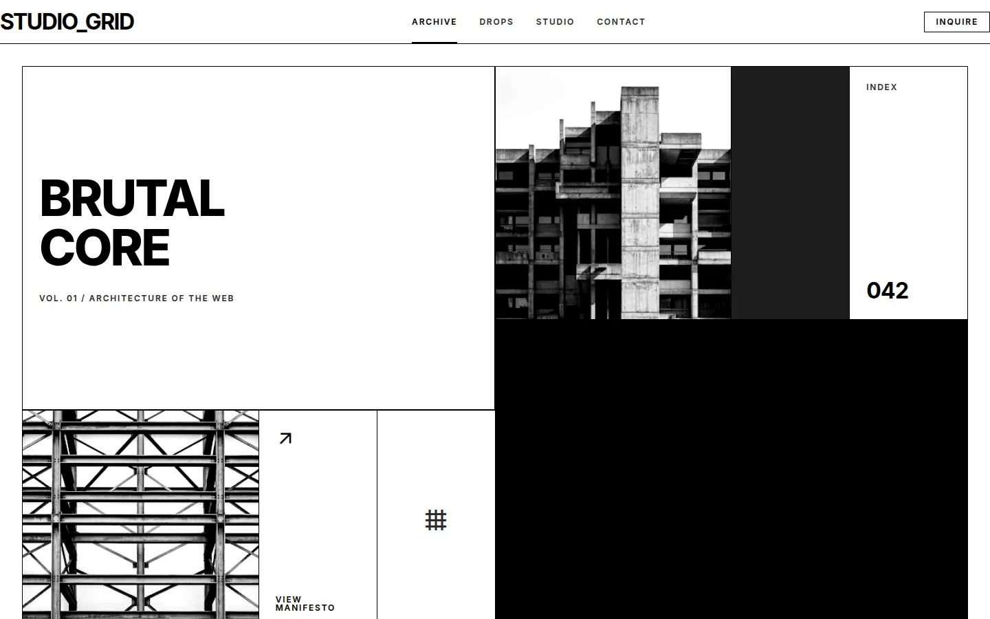
design studios, type foundries, architecture practices, people who want brutalism with grid discipline
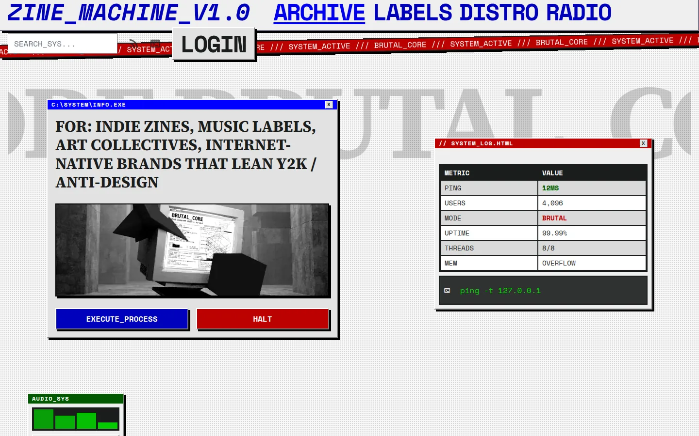
indie zines, music labels, art collectives, internet-native brands that lean Y2K / anti-design
Luxe
premium restraint; quality signalled by what is left out; warmth and confidence without volume
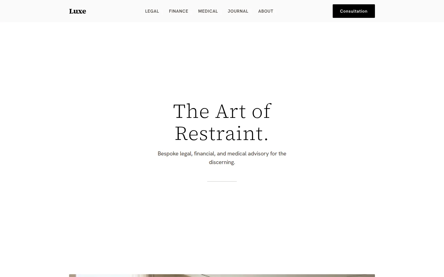
high-touch services, law / finance / medical practices, premium e-commerce, anything where trust and restraint signal quality
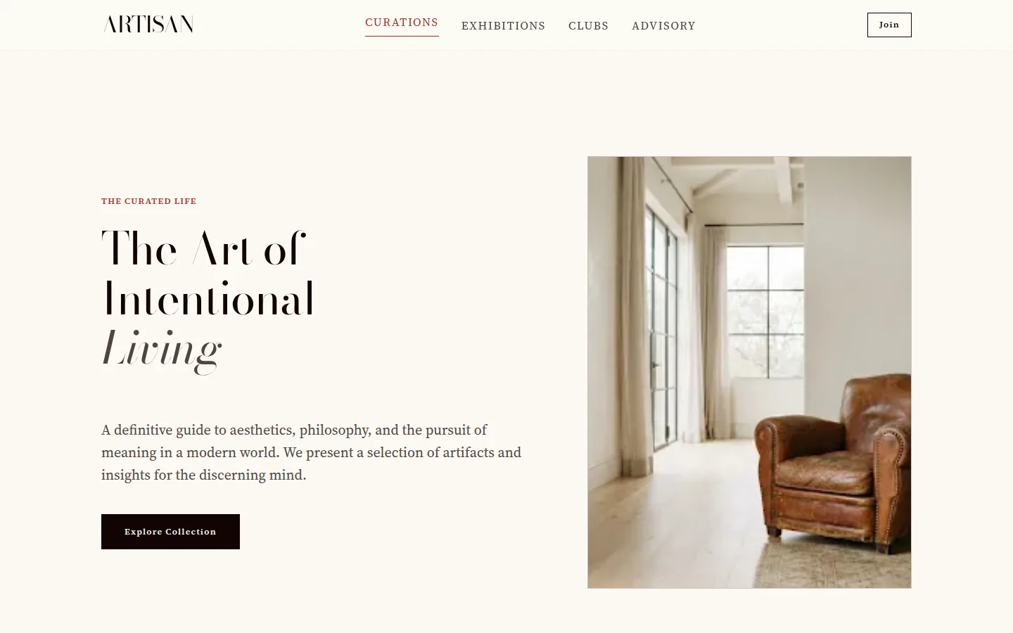
private members' clubs, art advisors, bespoke services, heritage brands; warmer and more typographic than minimal-luxe
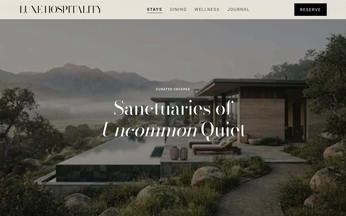
hotels, resorts, restaurants, destination brands, travel; photography-driven luxe
Dark
dark-first surface; the variant decides how loud the dark is
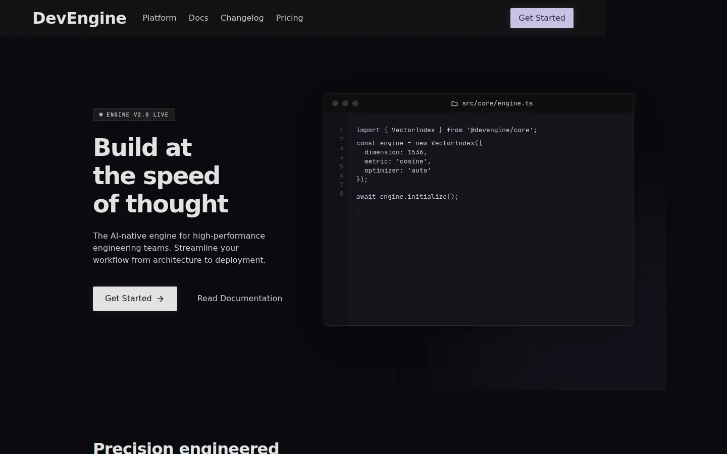
dev tools with taste, startup landing pages, AI tools that want to look serious (Linear, Vercel, Cursor territory)
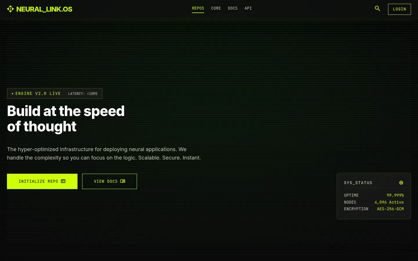
crypto, security tooling, audio / music tech, dev tools with personality, anything cyberpunk-adjacent
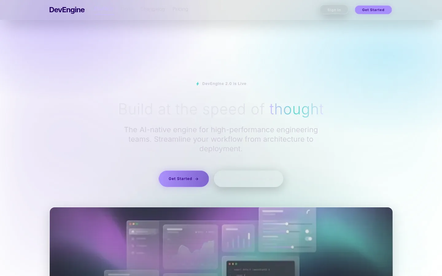
AI products with consumer ambition, modern OS-adjacent tools, anything that wants to feel native on macOS
Organic
nature and craft as the design grammar; soft curves, warm materials, restrained palettes drawn from earth and plant tones
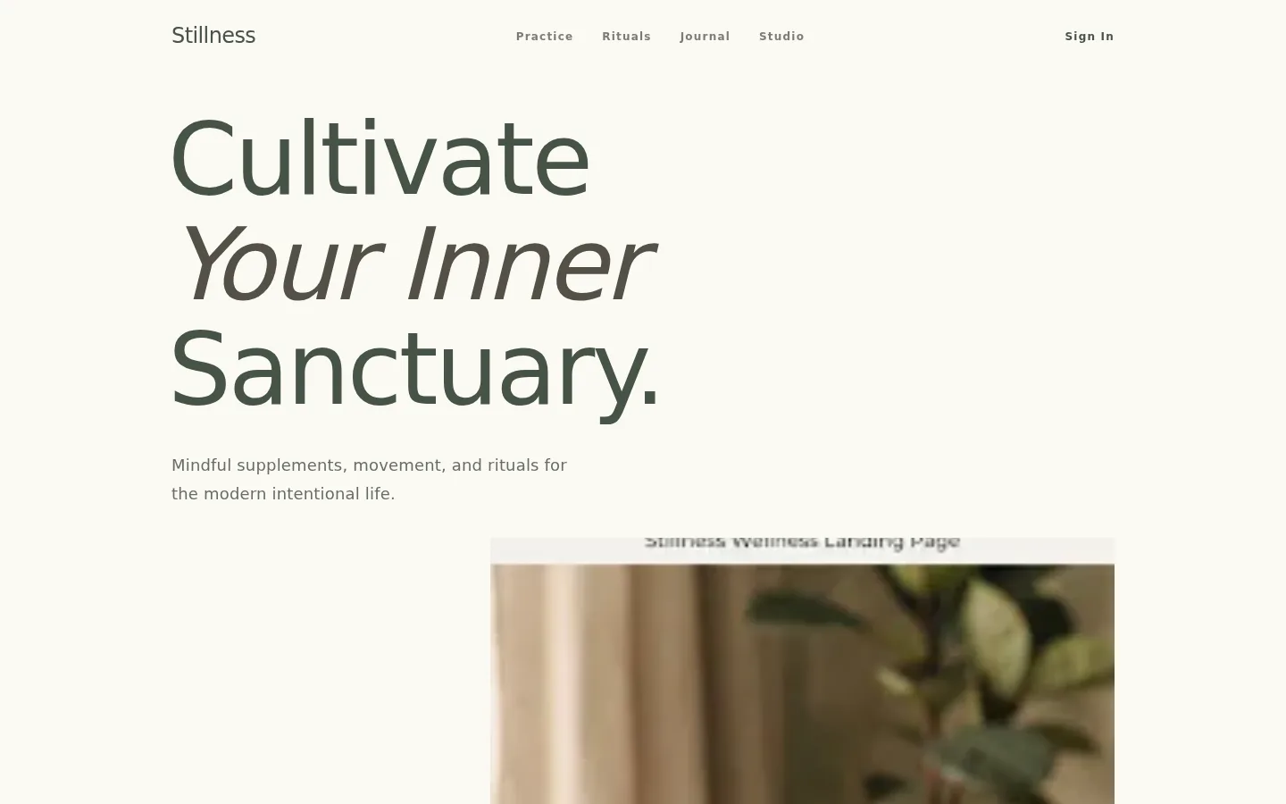
wellness brands, supplements, modern beauty, mindfulness apps, yoga and pilates studios
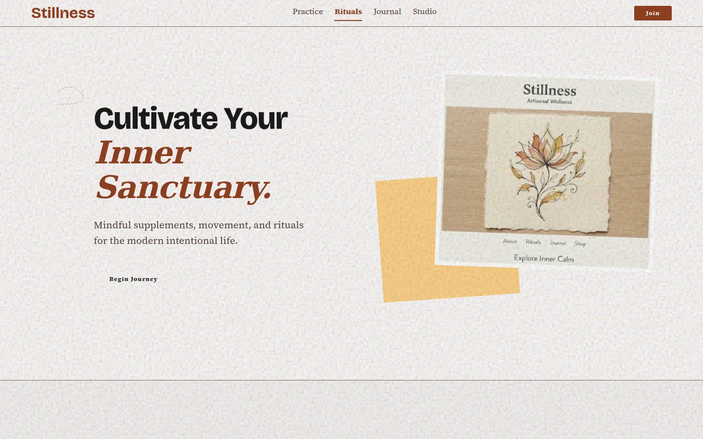
bakeries, breweries, craft food, small-batch makers, illustrated brand stories
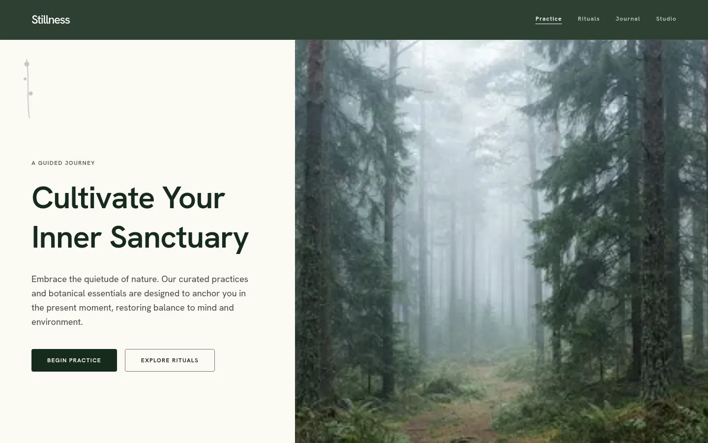
sustainable brands, outdoor outfitters, environmental nonprofits, regenerative agriculture
Expressive
maximalist, layered, opinionated; more is more; the opposite move from luxe restraint
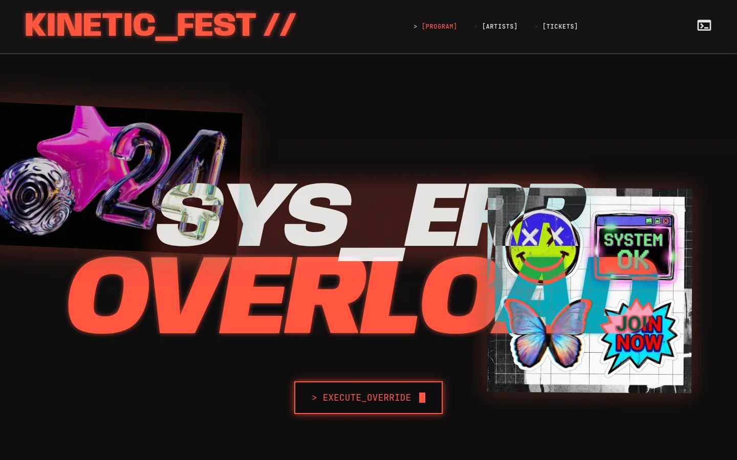
bold DTC brands, music and festival sites, agency portfolios with personality, anything where attention is the goal
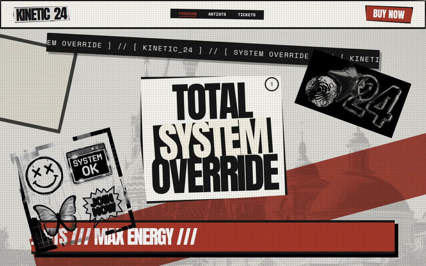
brands explicitly leaning on a specific era — 70s / 80s / 90s — in beauty, music, fashion drops, lifestyle
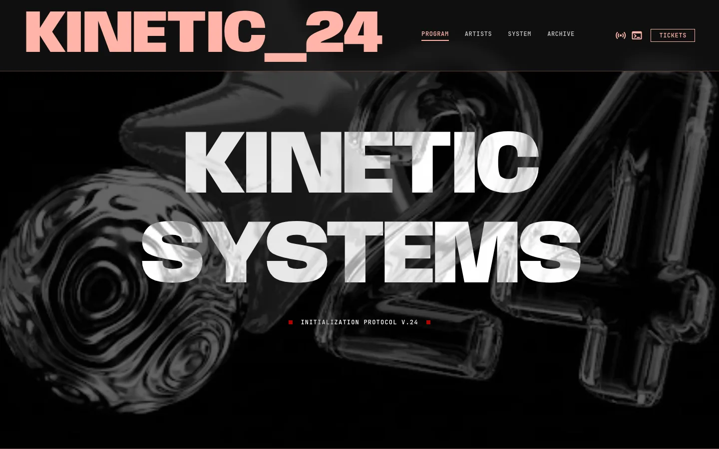
creative agencies, photographers, art-directed product brands, fashion-with-narrative